5  Exploratory Data Analysis

Setup Code (Click to Expand)
# packages needed to run the code in this section
# install.packages(c("tidyverse", "janitor", "skimr", "remotes"))
# remotes::install_github("StatsGary/MLDataR")
# remotes::install_github("NHS-South-Central-and-West/scwplot")

# import packages
suppressPackageStartupMessages({
  library(dplyr)
  library(ggplot2)
  library(scwplot)
})

# set plot theme
theme_set(scwplot::theme_scw(base_size = 16))

# import data
df <- MLDataR::heartdisease |>
  janitor::clean_names()

# convert discrete variables to factor type
df <- df |>
  mutate(
    sex = as.factor(sex),
    fasting_bs = as.factor(fasting_bs),
    resting_ecg = as.factor(resting_ecg),
    angina = as.factor(angina),
    heart_disease = as.factor(heart_disease)
  )

Exploratory data analysis (EDA) is the process of inspecting, visualising, and summarising a dataset. It is the first step in any data science project, and the importance of EDA can often be overlooked. Without exploring the data, it is difficult to know how to construct a piece of analysis or a model, and it is difficult to know if the data is suitable for the task at hand. As a critical step in the data science workflow, it is important to spend time on EDA and to be thorough and methodical in the process. While EDA is often the most time-consuming step in an analysis, taking the time to explore the data can save time in the long run.

EDA is an iterative process. In this tutorial, we will use the dplyr and ggplot2 packages to explore a dataset containing information about heart disease. We will start by inspecting the data itself, to get a sense of the structure and the components of the dataset, and to identify any data quality issues (such as missing values). We will then compute summary statistics to get a better understanding of the distribution and central tendency of the variables that are relevant to the analysis. Finally, we will use data visualisations to explore specific variables in more detail, and to identify any interesting relationships between variables.

5.1 Inspecting the Data

The first step when doing EDA is to inspect the data itself and get an idea of the structure of the dataset, the variable types, and the typical values of each variable. This gives a better understanding of exactly what data is being used and informs decisions both about the next steps in the exploratory process and any modelling choices.

We can use the head() and glimpse() functions to get a sense of the structure of the data. The head() function returns the first five rows of the data, and glimpse() returns a summary of the data, including the number of rows, the number of columns, the column names, the data type of each column, and the first few rows of the data. In addition to these two methods, we can use the distinct() function to get a list of all unique values of a particular variable. This is useful for discrete variables, such as the outcome variable, which can take on a limited number of values. For continuous variables (or any variables with a large number of unique values) the output of distinct() (a tibble) can be difficult to read, so we can use the unique() function to get a list of all unique values, which will be returned as a vector.

# view first rows in the dataset
head(df)
# A tibble: 6 × 10
    age sex   resting_bp cholesterol fasting_bs resting_ecg max_hr angina heart_peak_reading heart_disease
  <dbl> <fct>      <dbl>       <dbl> <fct>      <fct>        <dbl> <fct>               <dbl> <fct>        
1    40 M            140         289 0          Normal         172 N                     0   0            
2    49 F            160         180 0          Normal         156 N                     1   1            
3    37 M            130         283 0          ST              98 N                     0   0            
4    48 F            138         214 0          Normal         108 Y                     1.5 1            
5    54 M            150         195 0          Normal         122 N                     0   0            
6    39 M            120         339 0          Normal         170 N                     0   0            
# overview of the data
glimpse(df)
Rows: 918
Columns: 10
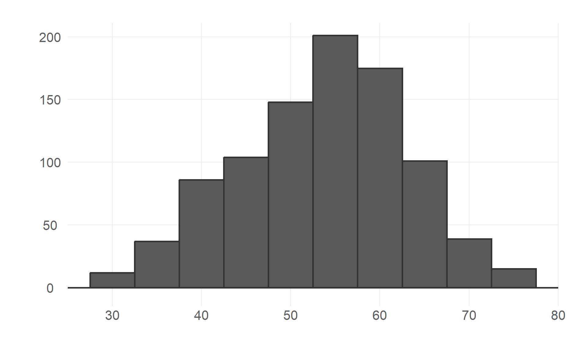
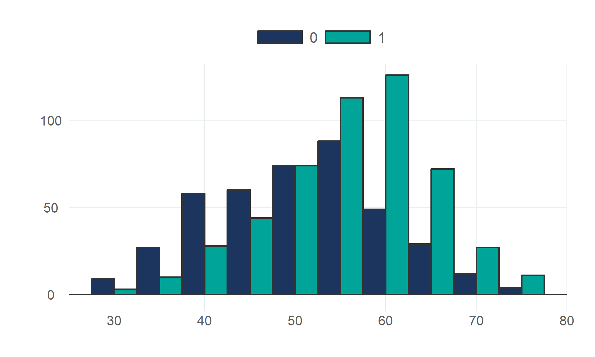
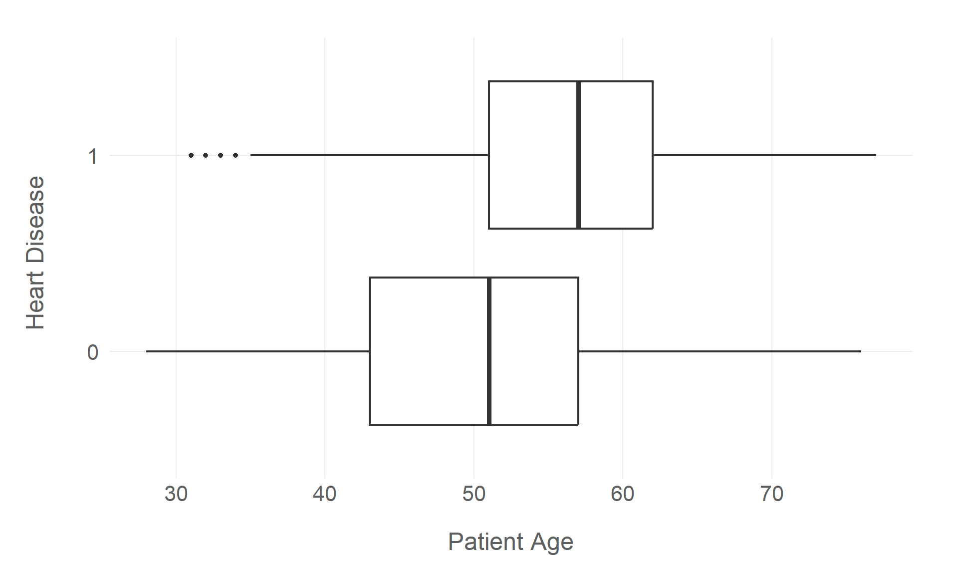
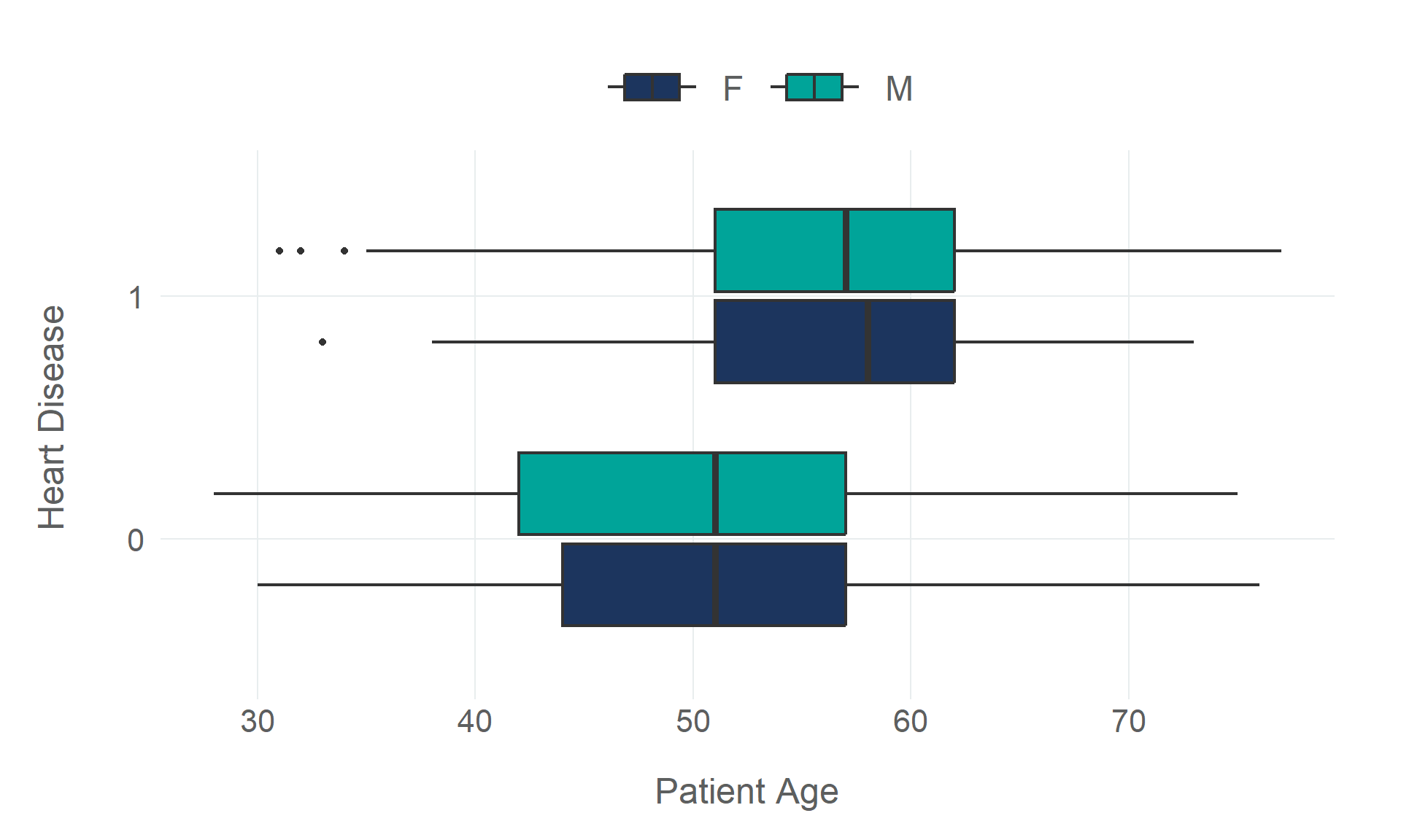
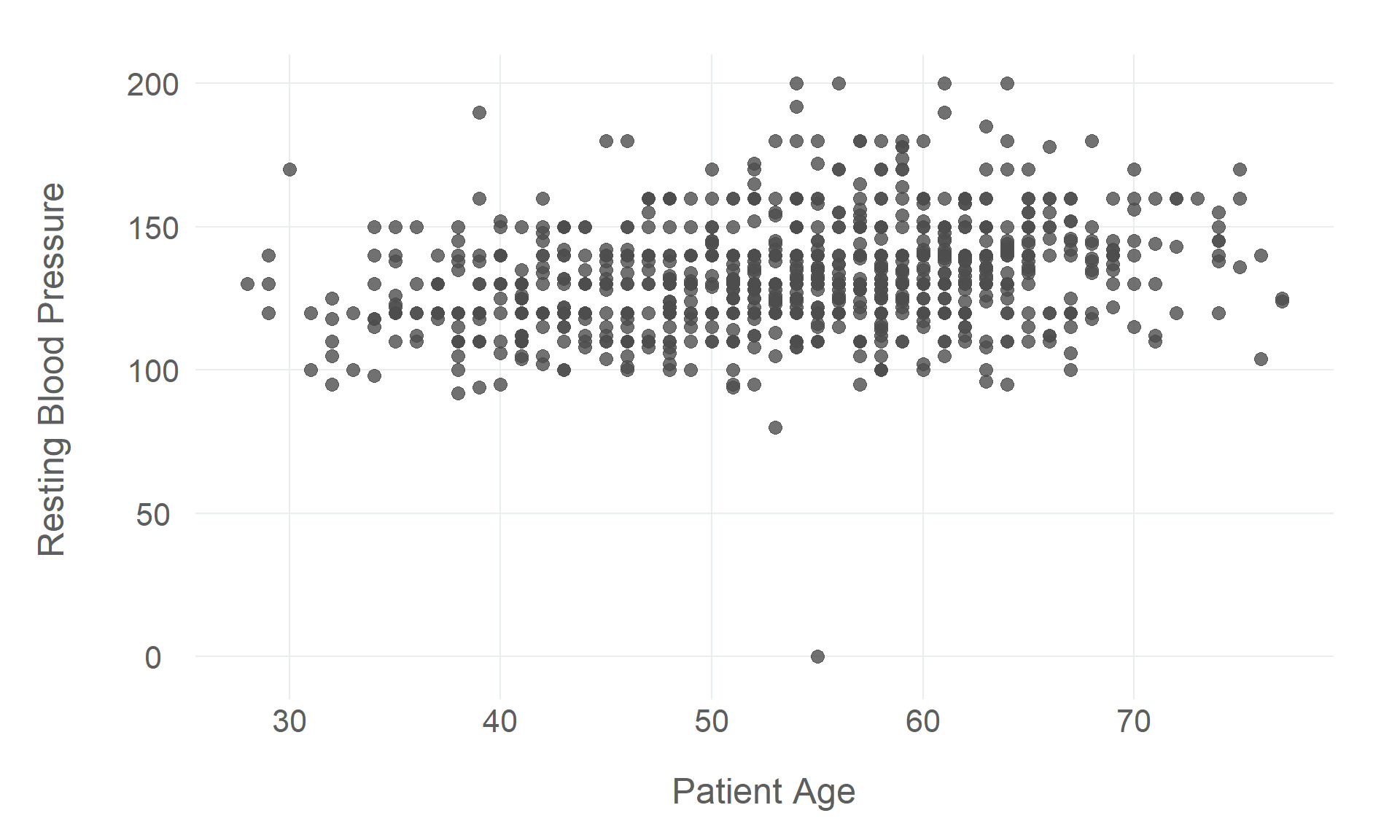
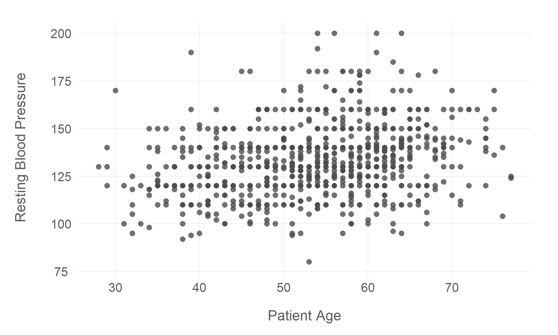
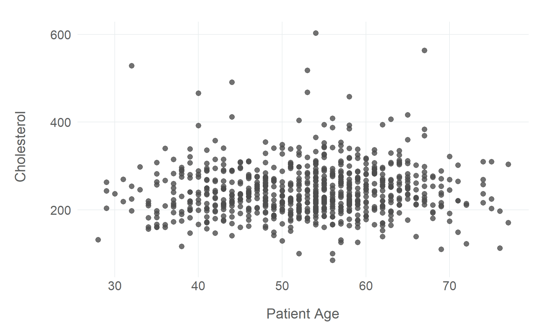
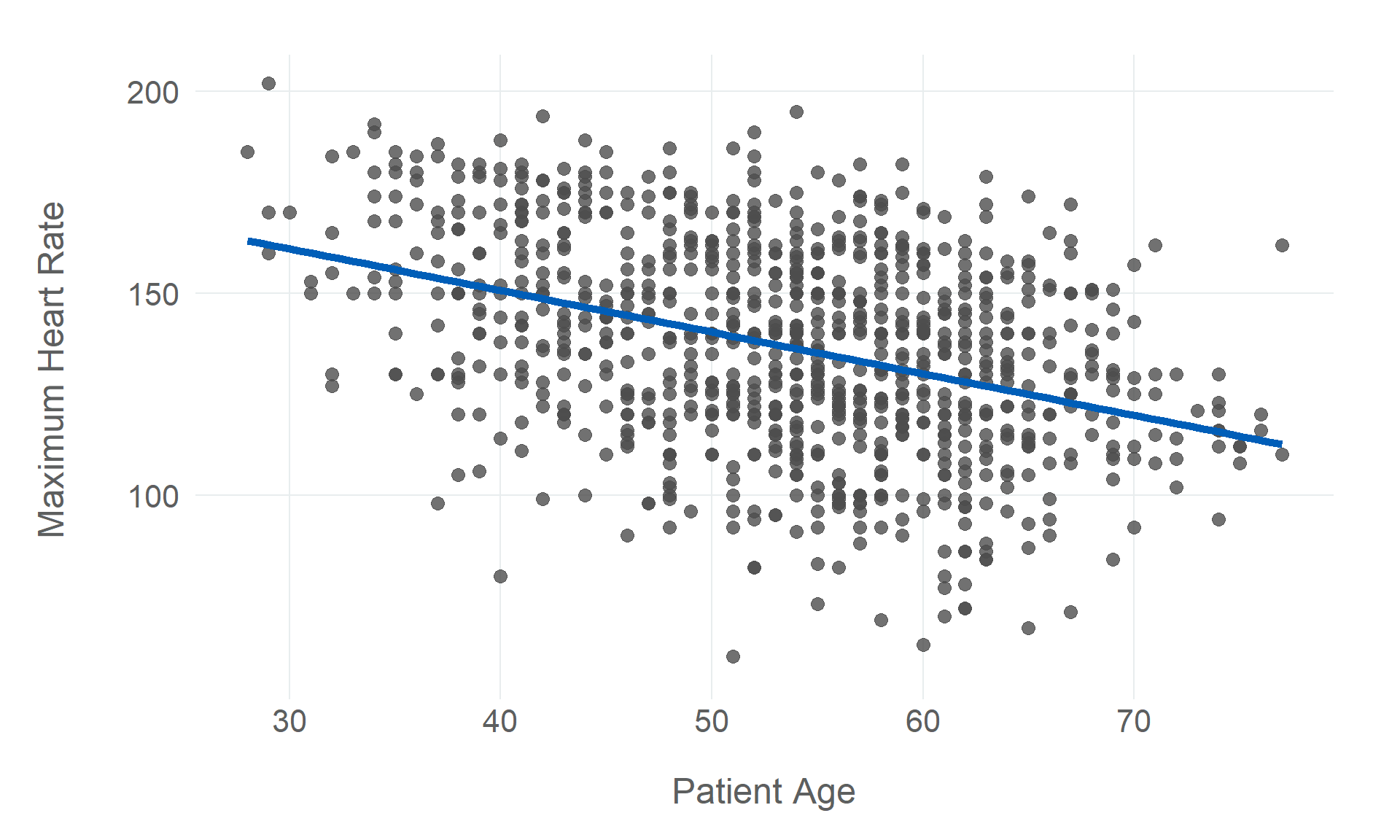
$ age                <dbl> 40, 49, 37, 48, 54, 39, 45, 54, 37, 48, 37, 58, 39, 49, 42, 54, 38, 43, 60, 36, 43, 44, 49,…
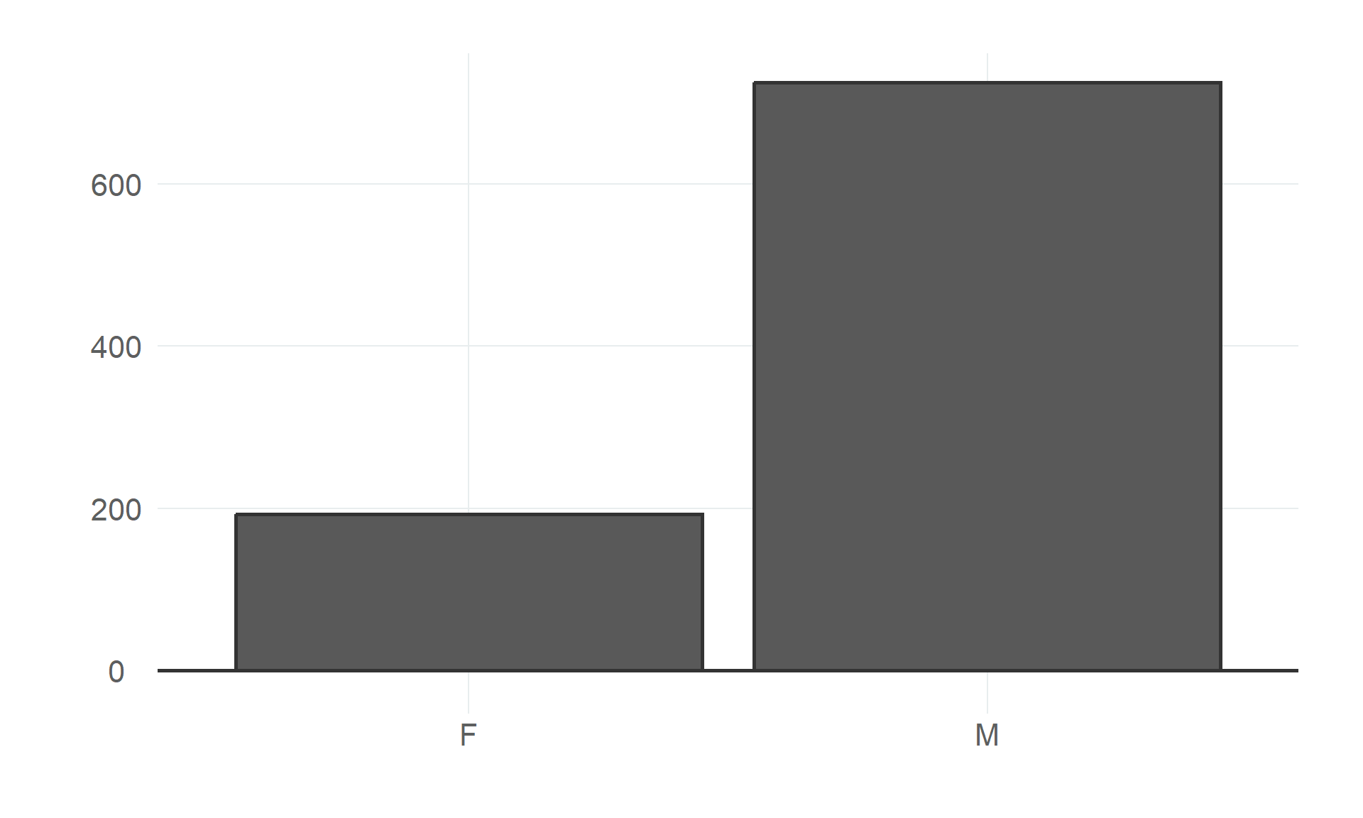
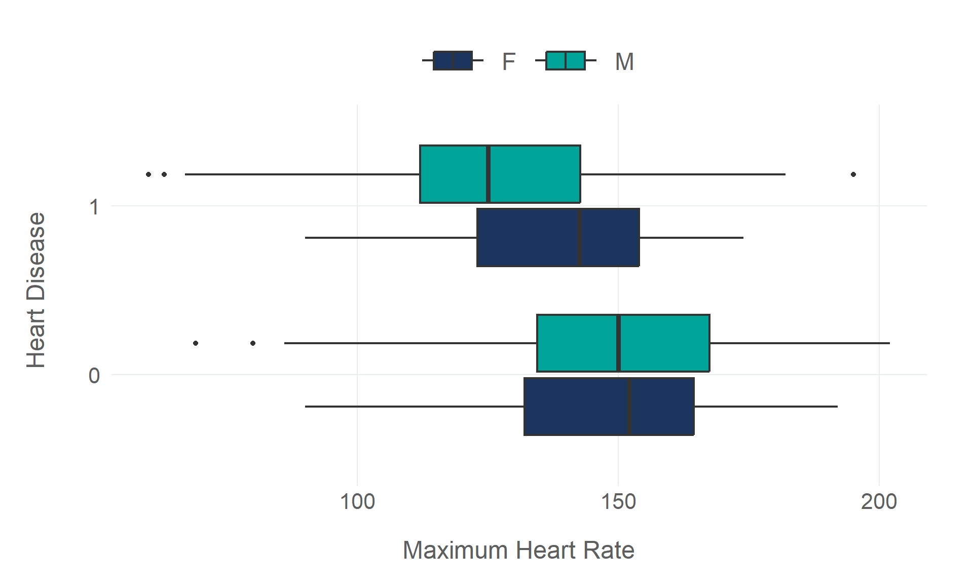
$ sex                <fct> M, F, M, F, M, M, F, M, M, F, F, M, M, M, F, F, M, F, M, M, F, M, F, M, M, M, M, M, F, M, M…
$ resting_bp         <dbl> 140, 160, 130, 138, 150, 120, 130, 110, 140, 120, 130, 136, 120, 140, 115, 120, 110, 120, 1…
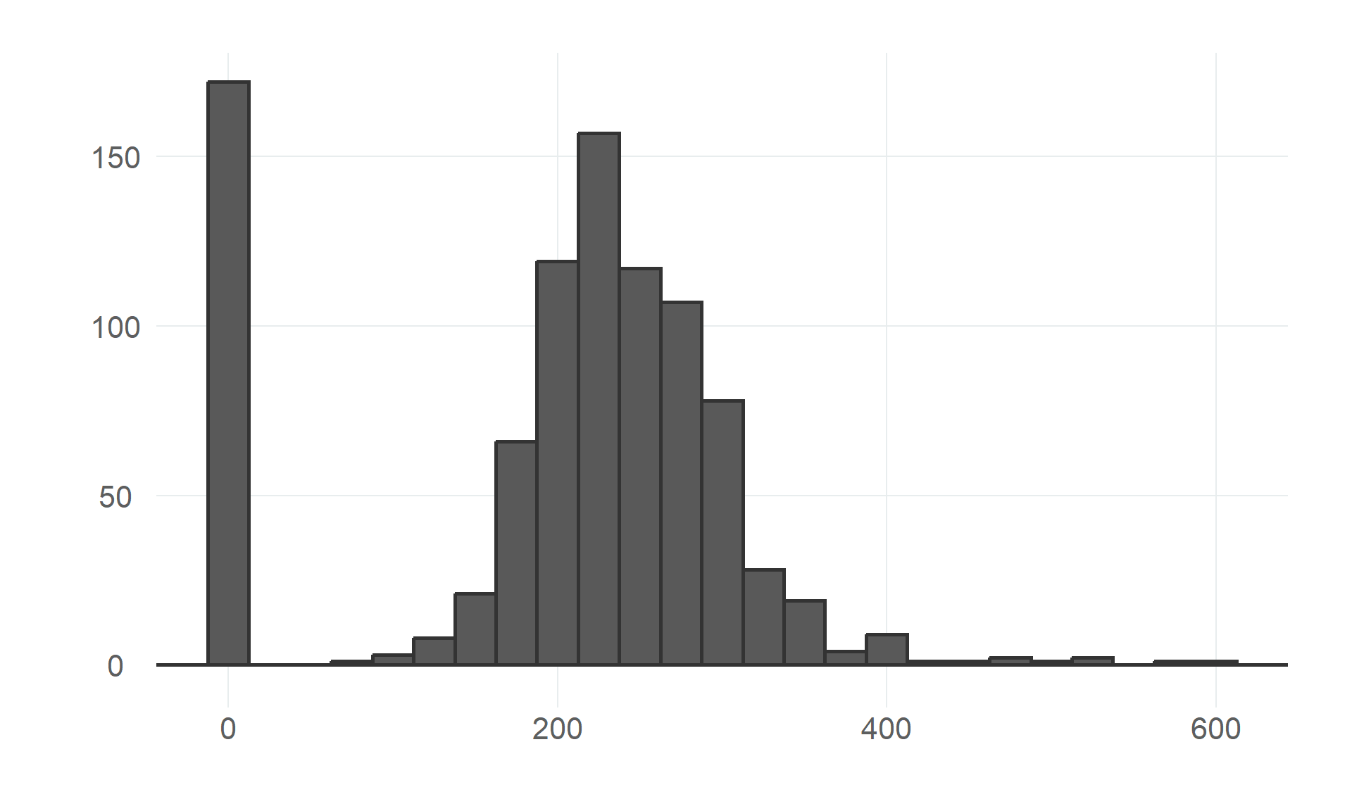
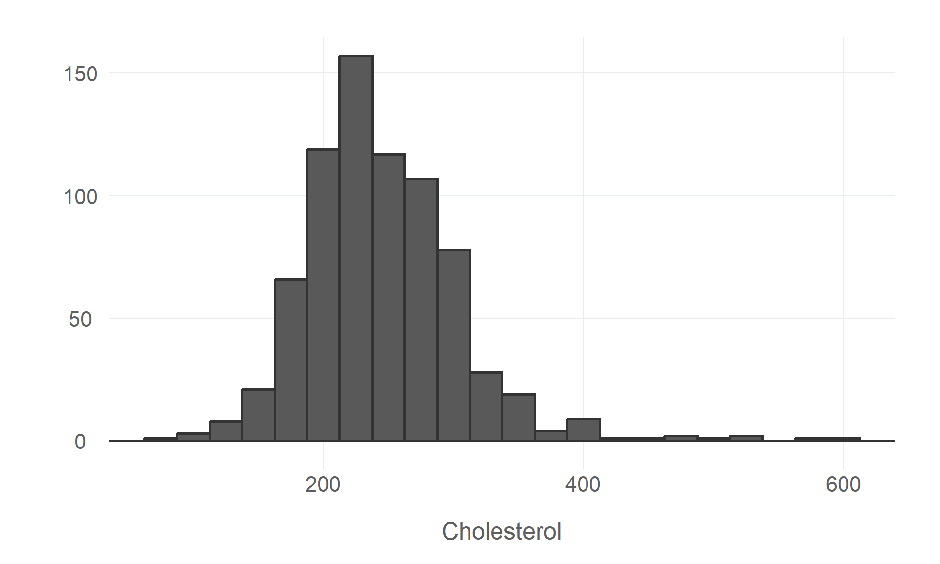
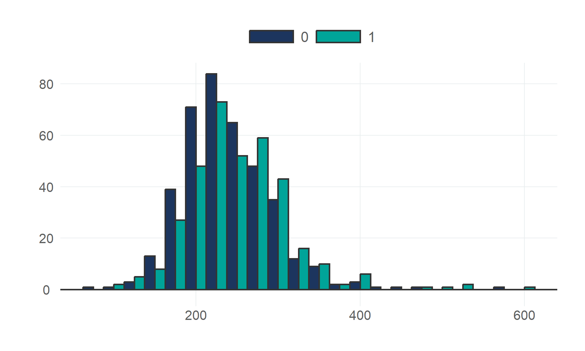
$ cholesterol        <dbl> 289, 180, 283, 214, 195, 339, 237, 208, 207, 284, 211, 164, 204, 234, 211, 273, 196, 201, 2…
$ fasting_bs         <fct> 0, 0, 0, 0, 0, 0, 0, 0, 0, 0, 0, 0, 0, 0, 0, 0, 0, 0, 0, 0, 0, 0, 0, 0, 0, 0, 0, 0, 0, 0, 0…
$ resting_ecg        <fct> Normal, Normal, ST, Normal, Normal, Normal, Normal, Normal, Normal, Normal, Normal, ST, Nor…
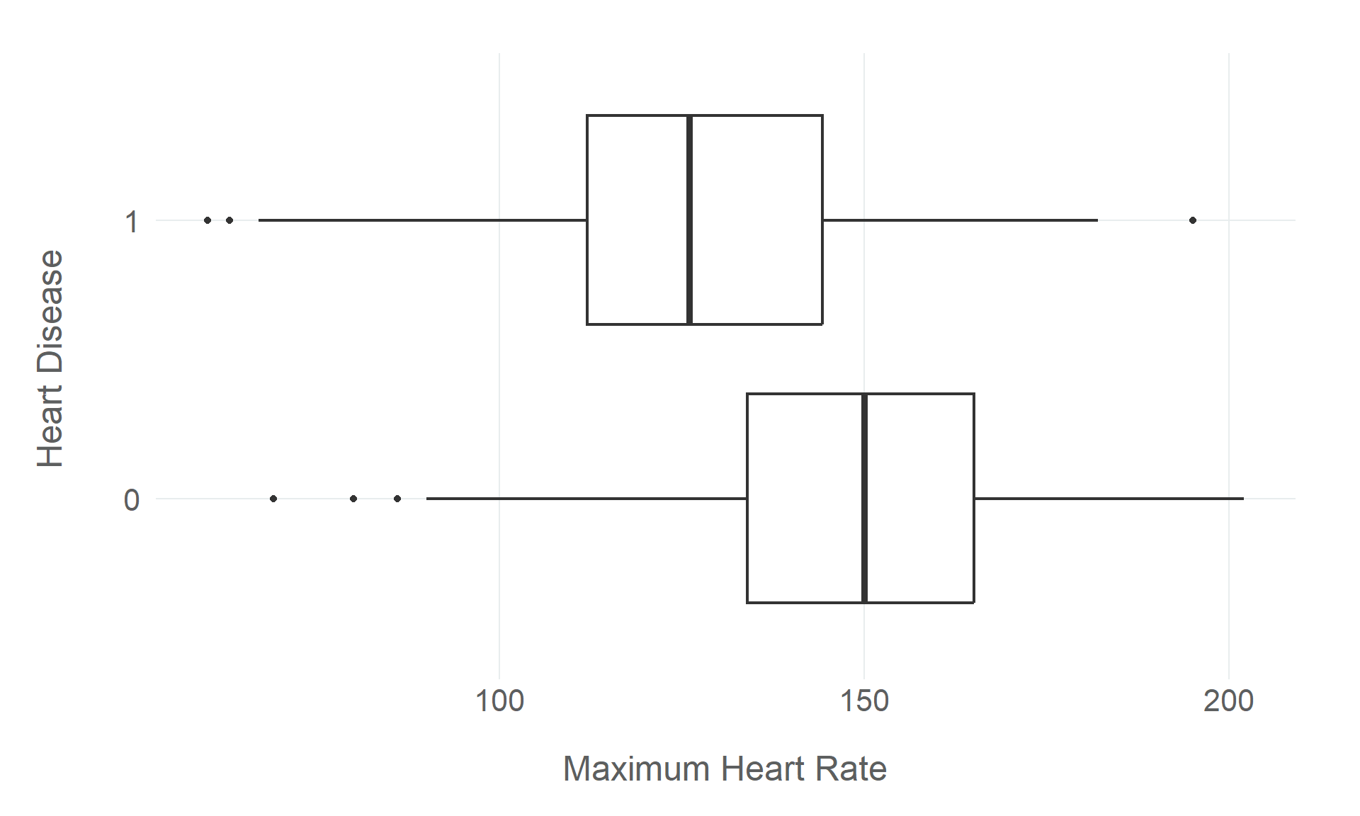
$ max_hr             <dbl> 172, 156, 98, 108, 122, 170, 170, 142, 130, 120, 142, 99, 145, 140, 137, 150, 166, 165, 125…
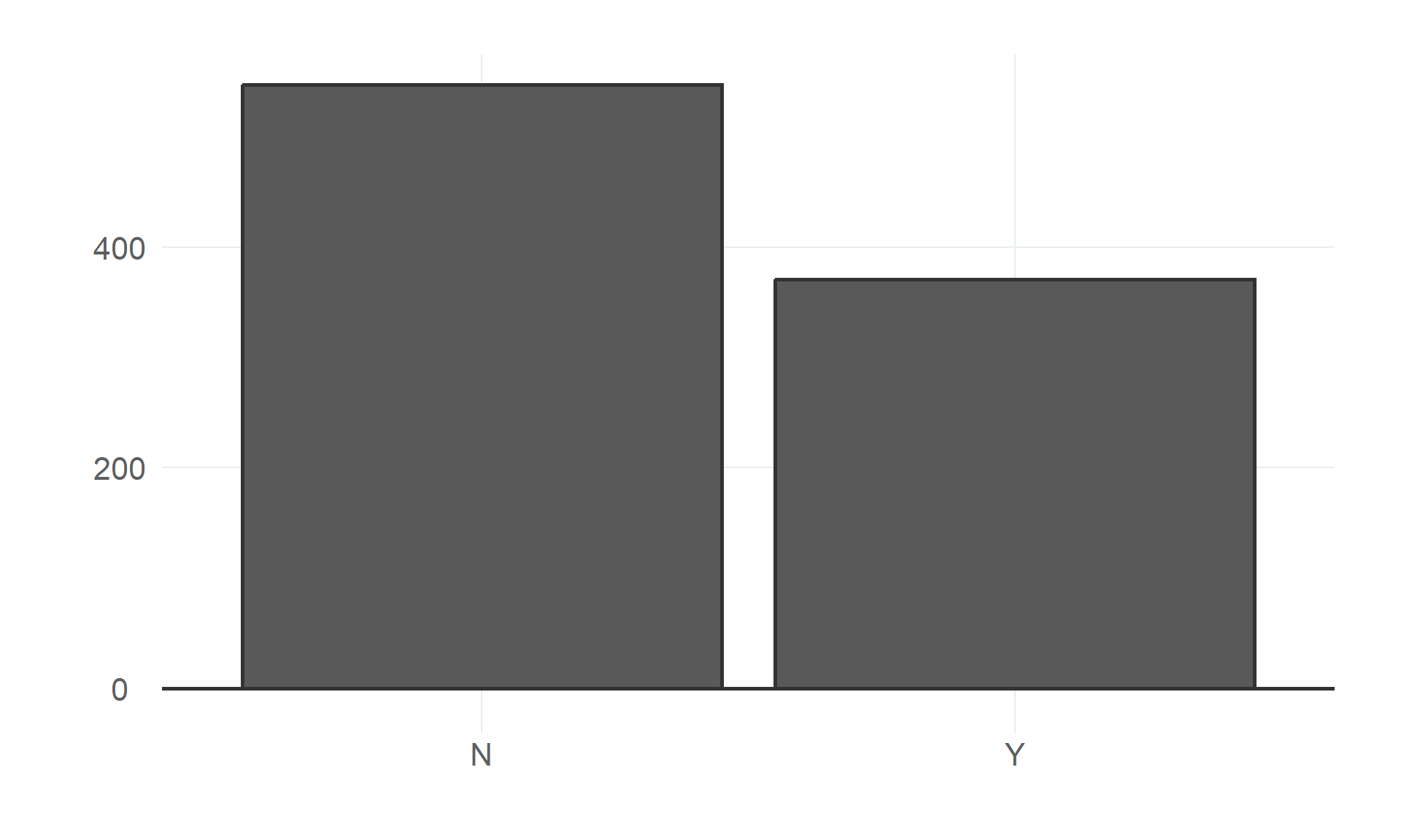
$ angina             <fct> N, N, N, Y, N, N, N, N, Y, N, N, Y, N, Y, N, N, N, N, N, N, N, N, N, Y, N, N, Y, N, N, N, N…
$ heart_peak_reading <dbl> 0.0, 1.0, 0.0, 1.5, 0.0, 0.0, 0.0, 0.0, 1.5, 0.0, 0.0, 2.0, 0.0, 1.0, 0.0, 1.5, 0.0, 0.0, 1…
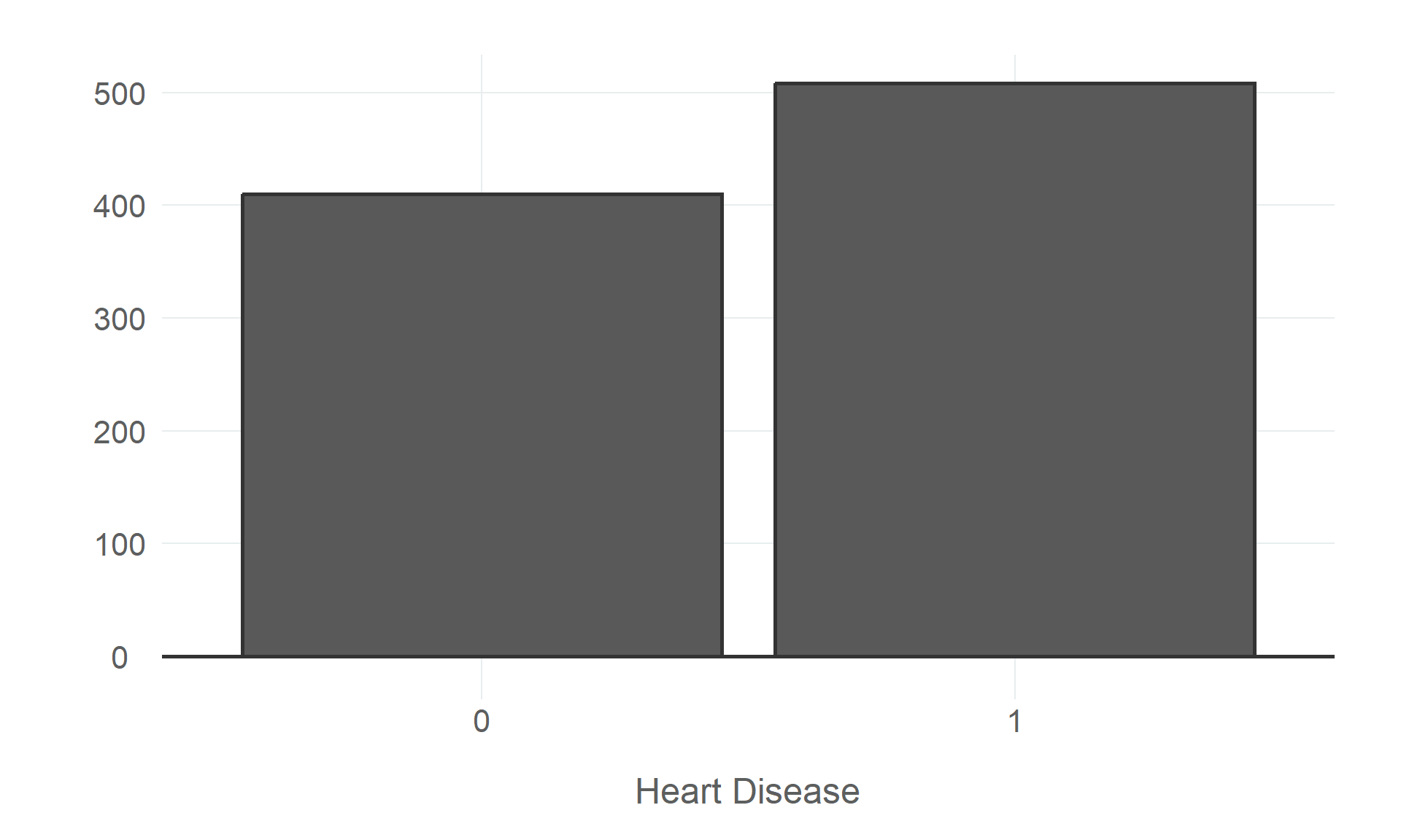
$ heart_disease      <fct> 0, 1, 0, 1, 0, 0, 0, 0, 1, 0, 0, 1, 0, 1, 0, 0, 1, 0, 1, 1, 0, 0, 0, 1, 0, 0, 0, 0, 0, 0, 1…
# unique values of the outcome variable
df |>
  distinct(heart_disease)
# A tibble: 2 × 1
  heart_disease
  <fct>        
1 0            
2 1            
# unique values of a continuous explanatory variable
unique(df$cholesterol)
  [1] 289 180 283 214 195 339 237 208 207 284 211 164 204 234 273 196 201 248 267 223 184 288 215 209 260 468 188 518
 [29] 167 224 172 186 254 306 250 177 227 230 294 264 259 175 318 216 340 233 205 245 194 270 213 365 342 253 277 202
 [57] 297 225 246 412 265 182 218 268 163 529 100 206 238 139 263 291 229 307 210 329 147  85 269 275 179 392 466 129
 [85] 241 255 276 282 338 160 156 272 240 393 161 228 292 388 166 247 331 341 243 279 198 249 168 603 159 190 185 290
[113] 212 231 222 235 320 187 266 287 404 312 251 328 285 280 192 193 308 219 257 132 226 217 303 298 256 117 295 173
[141] 315 281 309 200 336 355 326 171 491 271 274 394 221 126 305 220 242 347 344 358 169 181   0 236 203 153 316 311
[169] 252 458 384 258 349 142 197 113 261 310 232 110 123 170 369 152 244 165 337 300 333 385 322 564 239 293 407 149
[197] 199 417 178 319 354 330 302 313 141 327 304 286 360 262 325 299 409 174 183 321 353 335 278 157 176 131

5.2 Summary Statistics

Summary statistics are a quick and easy way to get a sense of the distribution, central tendency, and dispersion of the variables in the dataset. We can use the summary() function to get a summary of the data, including the mean and median values, the 1st and 3rd quartiles, and the minimum and maximum values of each numeric column. It also returns the count values for each factor column, and the number of NA values for each column.

While the base summary() function is pretty effective and works right out of the box, the package skimr can provide a more detailed summary of the data, using the skim() function. If you are looking for a single function to capture the entire process of inspecting the data and computing summary statistics, skim() is the function for the job, giving you a wealth of information about the dataset as a whole and each variable in the data.

If we want to examine a particular variable, the functions mean(), median(), quantile(), min(), and max() will return the same information as the summary() function. We can also get a sense of dispersion by computing the standard deviation or variance of a variable. The sd() function returns the standard deviation of a variable, and the var() function returns the variance.

Finally, we can use the count() function to get a count of the number of observations in each category of a discrete variable. Proportions can also be computed by dividing the count by the total number of observations. Using the group_by() function to group the data by a particular variable, and the mutate() function to add a new column to the data, we can compute the proportion as n/sum(n).

# summary of the data
summary(df)
      age        sex       resting_bp     cholesterol    fasting_bs resting_ecg      max_hr      angina 
 Min.   :28.00   F:193   Min.   :  0.0   Min.   :  0.0   0:704      LVH   :188   Min.   : 60.0   N:547  
 1st Qu.:47.00   M:725   1st Qu.:120.0   1st Qu.:173.2   1:214      Normal:552   1st Qu.:120.0   Y:371  
 Median :54.00           Median :130.0   Median :223.0              ST    :178   Median :138.0          
 Mean   :53.51           Mean   :132.4   Mean   :198.8                           Mean   :136.8          
 3rd Qu.:60.00           3rd Qu.:140.0   3rd Qu.:267.0                           3rd Qu.:156.0          
 Max.   :77.00           Max.   :200.0   Max.   :603.0                           Max.   :202.0          
 heart_peak_reading heart_disease
 Min.   :-2.6000    0:410        
 1st Qu.: 0.0000    1:508        
 Median : 0.6000                 
 Mean   : 0.8874                 
 3rd Qu.: 1.5000                 
 Max.   : 6.2000                 
# more detailed summary of the data
skimr::skim(df)
Data summary
Name df
Number of rows 918
Number of columns 10
_______________________
Column type frequency:
factor 5
numeric 5
________________________
Group variables None

Variable type: factor

skim_variable n_missing complete_rate ordered n_unique top_counts
sex 0 1 FALSE 2 M: 725, F: 193
fasting_bs 0 1 FALSE 2 0: 704, 1: 214
resting_ecg 0 1 FALSE 3 Nor: 552, LVH: 188, ST: 178
angina 0 1 FALSE 2 N: 547, Y: 371
heart_disease 0 1 FALSE 2 1: 508, 0: 410

Variable type: numeric

skim_variable n_missing complete_rate mean sd p0 p25 p50 p75 p100 hist
age 0 1 53.51 9.43 28.0 47.00 54.0 60.0 77.0 ▁▅▇▆▁
resting_bp 0 1 132.40 18.51 0.0 120.00 130.0 140.0 200.0 ▁▁▃▇▁
cholesterol 0 1 198.80 109.38 0.0 173.25 223.0 267.0 603.0 ▃▇▇▁▁
max_hr 0 1 136.81 25.46 60.0 120.00 138.0 156.0 202.0 ▁▃▇▆▂
heart_peak_reading 0 1 0.89 1.07 -2.6 0.00 0.6 1.5 6.2 ▁▇▆▁▁
# mean age
mean(df$age)
[1] 53.51089
# median age
median(df$age)
[1] 54
# min and max age
min(df$age)
[1] 28
max(df$age)
[1] 77
# dispersion of age
sd(df$age)
[1] 9.432617
var(df$age)
[1] 88.97425
# heart disease count
df |>
  count(heart_disease)
# A tibble: 2 × 2
  heart_disease     n
  <fct>         <int>
1 0               410
2 1               508
# resting ecg count
df |>
  count(resting_ecg)
# A tibble: 3 × 2
  resting_ecg     n
  <fct>       <int>
1 LVH           188
2 Normal        552
3 ST            178
# angina
df |>
  count(angina)
# A tibble: 2 × 2
  angina     n
  <fct>  <int>
1 N        547
2 Y        371
# cholesterol
df |>
  count(cholesterol)
# A tibble: 222 × 2
   cholesterol     n
         <dbl> <int>
 1           0   172
 2          85     1
 3         100     2
 4         110     1
 5         113     1
 6         117     1
 7         123     1
 8         126     2
 9         129     1
10         131     1
# ℹ 212 more rows
# heart disease proportion
df |> 
  group_by(resting_ecg) |> 
  count(heart_disease) |> 
  mutate(freq = n/sum(n))
# A tibble: 6 × 4
# Groups:   resting_ecg [3]
  resting_ecg heart_disease     n  freq
  <fct>       <fct>         <int> <dbl>
1 LVH         0                82 0.436
2 LVH         1               106 0.564
3 Normal      0               267 0.484
4 Normal      1               285 0.516
5 ST          0                61 0.343
6 ST          1               117 0.657

5.3 Data Visualisation

While inspecting the data directly and using summary statistics to describe it is a good first step, data visualisation is a more effective way to explore the data. It allows us to quickly identify patterns and relationships in the data, and to identify any data quality issues that might not be immediately obvious without a visual representation of the data.

When using data visualisation for exploratory purposes, the intent is generally to visualise the way data is distributed, both within and between variables. This can be done using a variety of different types of plots, including histograms, bar charts, box plots, scatter plots, and line plots. How variables are distributed can tell us a lot about the variable itself, and how variables are distributed relative to each other can tell us a lot about the potential relationship between the variables.

In this tutorial, we will use the ggplot2 package to create a series of data visualisations to explore the data in more detail. ggplot2 is an incredibly flexible and powerful package for creating data visualisations. While it can be a little difficult to make sense of the syntax at first, it is well worth the effort to learn how to use it. Learning how to use ggplot2 is beyond the scope of this tutorial, but there are a number of excellent resources available online, including the ggplot2 documentation.

5.3.1 Visualising Data Distributions

The first step in the exploratory process is to visualise the data distributions of key variables in the dataset. This allows us to get a sense of the typical values and central tendency of the variable, as well as identifying any outliers or other data quality issues.

5.3.1.1 Continuous Distributions

For continuous variables, we can use histograms to visualise the distribution of the data. We can use the geom_histogram() function to create a histogram of a continuous variable. The binwidth argument can be used to control the width of the bins in the histogram.

# age distribution
df |>
  ggplot(aes(age)) +
  geom_histogram(binwidth = 5, colour = "#333333", linewidth = 1) +
  geom_hline(yintercept = 0, colour = "#333333", linewidth = 1) +
  labs(x = NULL, y = NULL)

# max hr distribution
df |>
  ggplot(aes(max_hr)) +
  geom_histogram(binwidth = 10, colour = "#333333", linewidth = 1) +
  geom_hline(yintercept = 0, colour = "#333333", linewidth = 1) +
  labs(x = NULL, y = NULL)

# cholesterol distribution
df |>
  ggplot(aes(cholesterol)) +
  geom_histogram(binwidth = 25, colour = "#333333", linewidth = 1) +
  geom_hline(yintercept = 0, colour = "#333333", linewidth = 1) +
  labs(x = NULL, y = NULL)
(a) Age
(b) Maximum Heart Rate
(c) Cholesterol
Figure 5.1: Histograms plotting the distributions of relevant variables from the heart disease dataset.
# filter zero values
df |> 
  filter(cholesterol != 0) |> 
  ggplot(aes(cholesterol)) +
  geom_histogram(binwidth = 25, colour = "#333333", linewidth = 1) +
  geom_hline(yintercept = 0, colour = "#333333", linewidth = 1) +
  labs(x = "Cholesterol", y = NULL)
Figure 5.2: The distribution of cholesterol readings, with zero values filtered out to better visualise the non-zero distribution.

The inflated zero values in the cholesterol distribution suggests that there may be an issue with data quality that needs addressing.

5.3.1.2 Discrete Distributions

We can use bar charts to visualise the distribution of discrete variables. We can use the geom_bar() function to create a bar chart of a discrete variable.

# sex distribution
df |>
  ggplot(aes(sex)) +
  geom_bar(colour = "#333333", linewidth = 1) +
  geom_hline(yintercept = 0, colour = "#333333", linewidth = 1) +
  labs(x = NULL, y = NULL)


# angina distribution
df |>
  ggplot(aes(angina)) + 
  geom_bar(colour = "#333333", linewidth = 1) +
  geom_hline(yintercept = 0, colour = "#333333", linewidth = 1) +
  labs(x = NULL, y = NULL)
(a) Patient Sex
(b) Angina
Figure 5.3: Bar charts plotting discrete variables from the heart disease dataset.
# heart disease distribution
df |>
  ggplot(aes(heart_disease)) +
  geom_bar(colour = "#333333", linewidth = 1) +
  geom_hline(yintercept = 0, colour = "#333333", linewidth = 1) +
  labs(x = "Heart Disease", y = NULL)
Figure 5.4: The distribution of the outcome variable, heart disease.

5.3.2 Comparing Distributions

There are a number of ways to compare the distributions of multiple variables. Bar charts can be used to visualise two discrete variables, while histograms and box plots are useful for comparing the distribution of a continuous variable across the groups of a discrete variable, and scatter plots are particularly useful for comparing the distribution of two continuous variables.

5.3.2.1 Visualising Multiple Discrete Variables

Bar charts are an effective way to visualize the observed relationship (or association, at least) between a discrete explanatory variable and a discrete outcome (whether binary, ordinal, or categorical).

We can use the geom_bar() function to create bar charts, but the default behaviour is to display the bars as stacked bars, which is not necessarily ideal for visualising discrete variables (though I’d recommend playing around with this yourself to decide what works in each case)

The position argument controls how the bars are displayed. The default position = 'stack' argument will display the bars as stacked bars, while the position = 'dodge' argument will display the bars side-by-side, and the position = 'fill' argument will display the bars as a proportion of the total number of observations in each category.

Finally, the fill argument splits the bars by a particular variable and display them in different colours.

# heart disease by sex
df |>
  ggplot(aes(heart_disease, fill = sex)) +
  geom_bar(position = 'dodge', colour = "#333333", linewidth = 1) +
  geom_hline(yintercept = 0, colour = "#333333", linewidth = 1) +
  scale_fill_qualitative(palette = "scw") +
  labs(x = "Heart Disease", y = NULL)

# resting ecg
df |>
  ggplot(aes(heart_disease, fill = resting_ecg)) +
  geom_bar(position = 'dodge', colour = "#333333", linewidth = 1) +
  geom_hline(yintercept = 0, colour = "#333333", linewidth = 1) +
  scale_fill_qualitative(palette = "scw") +
  labs(x = "Heart Disease", y = NULL)

# angina
df |>
  ggplot(aes(heart_disease, fill = angina)) +
  geom_bar(position = 'dodge', colour = "#333333", linewidth = 1) +
  geom_hline(yintercept = 0, colour = "#333333", linewidth = 1) +
  scale_fill_qualitative(palette = "scw") +
  labs(x = "Heart Disease", y = NULL)

# fasting bs
df |>
  ggplot(aes(heart_disease, fill = fasting_bs)) +
  geom_bar(position = 'dodge', colour = "#333333", linewidth = 1) +
  geom_hline(yintercept = 0, colour = "#333333", linewidth = 1) +
  scale_fill_qualitative(palette = "scw") +
  labs(x = "Heart Disease", y = NULL)
(a) Patient Sex
(b) Resting ECG
(c) Angina
(d) Fasting Blood Sugar
Figure 5.5: Bar charts plotting discrete variables from the heart disease dataset against the outcome variable, heart disease.

5.3.2.2 Visualising A Continuous Variable Across Discrete Groups

Histograms and box plots are useful for comparing the distribution of a continuous variable across the groups of a discrete variable.

5.3.2.2.1 Histogram Plots

We can use the geom_histogram() function to create histograms. The fill and position arguments can be used to split the bars by a particular variable and display them in different colours, as discussed above.

# age distribution by heart disease
df |>
  ggplot(aes(age, fill = heart_disease)) +
  geom_histogram(
    binwidth = 5, position = 'dodge', 
    colour = "#333333", linewidth = 1
    ) +
  geom_hline(yintercept = 0, colour = "#333333", linewidth = 1) +
  scale_fill_qualitative(palette = "scw") +
  labs(x = NULL, y = NULL)

# filter zero values
df |> 
  filter(cholesterol != 0) |> 
  ggplot(aes(cholesterol, fill = heart_disease)) +
  geom_histogram(
    binwidth = 25, position = 'dodge', 
    colour = "#333333", linewidth = 1
    ) +
  geom_hline(yintercept = 0, colour = "#333333", linewidth = 1) +
  scale_fill_qualitative(palette = "scw") +
  labs(x = NULL, y = NULL)
(a) Patient Age by Heart Disease
(b) Cholesterol (Zero Values Filtered) by Heart Disease
Figure 5.6: Histograms plotting the distribution of continuous variables from the heart disease dataset against the outcome variable, heart disease.

The fact that there is a significantly larger proportion of positive heart disease cases in the zero cholesterol values further demonstrates the need to address this data quality issue.

5.3.2.2.2 Box Plots

Box plots visualize the characteristics of a continuous distribution over discrete groups. We can use the geom_boxplot() function to create box plots, and the fill() argument to split the box plots by a particular variable and display them in different colours.

However, while box plots can be very useful, they are not always the most effective way of visualising this information, as explained here by Cedric Scherer. This guide uses box plots for the sake of simplicity, but it is worth considering other options when visualising distributions.

# age & heart disease
df |>
  ggplot(aes(age, heart_disease)) +
  geom_boxplot(size=0.8) +
  scale_fill_qualitative(palette = "scw") +
  labs(x = "Patient Age", y = "Heart Disease")

# age & heart disease, split by sex
df |>
  ggplot(aes(age, heart_disease, fill = sex)) +
  geom_boxplot(size=0.8) +
  scale_fill_qualitative(palette = "scw") +
  labs(x = "Patient Age", y = "Heart Disease")

# max hr & heart disease
df |>
  ggplot(aes(max_hr, heart_disease)) +
  geom_boxplot(size=0.8) +
  scale_fill_qualitative(palette = "scw") +
  labs(x = "Maximum Heart Rate", y = "Heart Disease")

# max hr & heart disease, split by sex
df |>
  ggplot(aes(max_hr, heart_disease, fill = sex)) +
  geom_boxplot(size=0.8) +
  scale_fill_qualitative(palette = "scw") +
  labs(x = "Maximum Heart Rate", y = "Heart Disease")
(a) Patient Age
(b) Patient Age, Split by Sex
(c) Maximum Heart Rate
(d) Maximum Heart Rate, Split by Sex
Figure 5.7: Box plots visualising continuous distributions over the discrete outcome variable, heart disease.

5.3.2.3 Visualising Multiple Discrete Variables

Scatter plots are an effective way to visualize how two continuous variables vary together. We can use the geom_point() function to create scatter plots, and the colour argument to split the scatter plots by a particular variable and display them in different colours.

# age & resting bp
df |> 
  ggplot(aes(age, resting_bp)) +
  geom_point(alpha = 0.8, size = 3, colour = 'gray30') +
  labs(x = "Patient Age", y = "Resting Blood Pressure")
  
# filter zero values
df |>
  filter(resting_bp != 0) |> 
  ggplot(aes(age, resting_bp)) +
  geom_point(alpha = 0.8, size = 3, colour = 'gray30') +
  labs(x = "Patient Age", y = "Resting Blood Pressure")

# age & cholesterol
df |>
  filter(cholesterol != 0) |> 
  ggplot(aes(age, cholesterol)) +
  geom_point(alpha = 0.8, size = 3, colour = 'gray30') +
  labs(x = "Patient Age", y = "Cholesterol")

# age & max hr
df |>
  ggplot(aes(age, max_hr)) +
  geom_point(alpha = 0.8, size = 3, colour = 'gray30') +
  labs(x = "Patient Age", y = "Maximum Heart Rate")
(a) Patient Age & Resting Blood Pressure
(b) Patient Age & Resting Blood Pressure (Zero Values Filtered)
(c) Patient Age & Cholesterol (Zero Values Filtered)
(d) Patient Age & Maximum Heart Rate
Figure 5.8: Scatter plots visualising two continuous distributions together.

The scatter plot visualising age and resting blood pressure highlights another observation that needs to be removed due to data quality issues.

If there appears to be an association between the two continuous variables that you have plotted, as is the case with age and maximum heart rate in the above plot, you can also add a regression line to visualize the strength of that association. The geom_smooth() function can be used to add a regression line to a scatter plot. The method argument specifies the type of regression line to be added, and the se argument specifies whether or not to display the standard error of the regression line.

# age & max hr
df |>
  ggplot(aes(age, max_hr)) +
  geom_point(alpha = 0.8, size = 3, colour = 'gray30') +
  geom_smooth(method = lm, se = FALSE, size = 2, colour='#005EB8') +
  labs(x = "Patient Age", y = "Maximum Heart Rate")
Figure 5.9: Scatter plot visualising the distribution of patient age and maximum heart rate with a regression line fit to the data.

You can also include discrete variables by assigning the discrete groups different colours in the scatter plot, and if you add regression lines to these plots, separate regression lines will be fit to the discrete groups. This can be useful for visualising how the association between the two continuous variables varies across the discrete groups.

# age & resting bp, split by heart disease
df |>
  filter(resting_bp != 0) |> 
  ggplot(aes(age, resting_bp, colour = heart_disease)) +
  geom_point(alpha = 0.8, size = 3) +
  scale_colour_qualitative(palette = "scw") +
  labs(x = "Patient Age", y = "Resting Blood Pressure")

# age & cholesterol, split by heart disease (with regression line)
df |>
  filter(cholesterol!=0) |> 
  ggplot(aes(age, cholesterol, colour = heart_disease)) +
  geom_point(size = 3, alpha = 0.8) +
  geom_smooth(method = lm, se = FALSE, size = 1.5) +
  scale_colour_qualitative(palette = "scw") +
  labs(x = "Patient Age", y = "Resting Blood Pressure")

# age & max hr, split by heart disease (with regression line)
df |>
  ggplot(aes(age, max_hr, colour = heart_disease)) +
  geom_point(size = 3, alpha = 0.8)+
  geom_smooth(method = lm, se = FALSE, size = 1.5) +
  scale_colour_qualitative(palette = "scw") +
  labs(x = "Patient Age", y = "Maximum Heart Rate")
(a) Patient Age & Resting Blood Pressure
(b) Patient Age & Cholesterol (Zero Values Filtered)
(c) Patient Age & Maximum Heart Rate
Figure 5.10: Scatter plots visualising continuous distributions together, with the data split and coloured by the discrete outcome variable, heart disease.

5.4 Next Steps

There are many more visualisation techniques that you can use to explore your data, and you can find a comprehensive list of them on the ggplot2 function reference page. There are also a wide variety of ggplot extension packages that can be used to create more complex visualisations.

The next step in the data science process is to build a model to either explain or predict the outcome variable, heart disease. The exploratory work done here can help inform decisions about the choice of the model, and the choice of the variables that will be used to build the model. It will also help clean up the data, particularly the zero values in the cholesterol and resting blood pressure variables, to ensure that the model is built on the best possible data.

5.5 Resources

There are a wealth of resources available to help you learn more about data visualisation.