# packages needed to run the code in this section# install.packages(c("tidyverse", "tidymodels", "tidyclust, "remotes"))# remotes::install_github("NHS-South-Central-and-West/scwplot")# import packagessuppressPackageStartupMessages({library(tidymodels)library(tidyclust)library(dplyr)library(ggplot2)})# import datapublic_health <- readr::read_csv(here::here("data", "public_health.csv")) |>mutate(imd_quartile =case_match( imd_decile,c(1, 2) ~1,c(3, 4) ~2,c(5, 6) ~3,c(7, 8) ~4,c(9, 10) ~5 ) )# set plot themetheme_set(scwplot::theme_scw(base_size =14))# set random seedset.seed(123)
Unsupervised learning is a domain of machine learning that handles input data that is unlabelled. While supervised learning takes a label, like a binary variable that represents whether someone has a certain disease or not (classification), or a continuous variable of the days someone has spent in hospital (regression), unsupervised learning is not trying to predict a particular outcome. Instead, the goal of unsupervised learning is to learn/model the underlying structure of the data, and using that process to explain that data.
This creates some inherent complexity to the process of unsupervised learning that isn’t a consideration when doing supervised learning. Most of all, it is difficult to know what features should go in the model and how to validate the model after you have built it.
Unsupervised learning tends to get boiled down to clustering when it is introduced as a domain of machine learning. While this is definitely the most popular way this domain is used, there’s a lot more to it than that.
In this chapter, we will build a clustering model, while discussing some other areas of unsupervised learning that might be of some interest.
The two big areas of unsupervised learning are dimensionality reduction and clustering.
9.1 Dimensionality Reduction
One of the most common goals of unsupervised learning is trying to reduce complicated datasets with many dimensions (columns/features/variables) down to a smaller, more easily understood dataset.
There are lots of use cases for this sort of process. One particularly common use case is visualising a complex dataset with many dimensions using just two dimensions.
It can also be a really useful step in the data preprocessing of building either a supervised or unsupervised machine learning model. When there are multiple related features in your model, multicollinearity1 can weaken the predictive performance of your model, or limit its capacity to identify a meaningful latent structure in the data. Dimensionality reduction attempts to squash these related features down to just one feature (dimension) and give a representation of those features that captures their contribution to the variance in the data.
9.1.1 Principal Component Analysis
The most popular (and still very useful) approach to dimensionality reduction is a method called Principal Component Analysis (PCA). PCA reduces data to fewer dimensions by taking the centre point of the space the data exists in (often referred to as a hyperplane or a feature subspace), and finds the axes in that space that captures the data (or the variance in the data) in simpler terms (fewer dimensions). This involves taking the
I find a simple way of thinking about this process is that it is about taking a “large set of correlated variables” and summarising them “with a smaller number of representative variables that collectively explain most of the variability in the original set” (James et al. 2023). When PCA reduces a dataset to fewer dimensions, the first principal components should capture most of the variance in the data.
There are lots of other methods for doing dimensionality reduction (some examples include Linear Discriminant Analysis, UMAP, t-SNE), we will stick with PCA in this guide, to show you what this process is doing, and how it can be useful in a variety of data science contexts.
Although unsupervised methods do not have labels that they will try to predict, validating an unsupervised model still requires data, and using the same variables that the model has been trained on is a problematic way of evaluating performance, because a model that has been trained on the underlying structure of a set of variables should probably do quite a good job when given those same variables!
Therefore, in this instance, we will use the IMD Deciles as our validation data. The public health data we are using has a number of variables that should contribute to deprivation (or that are negatively impacted by deprivation), so we should expect a good model to fit well to IMD deciles.
train_test_split <-initial_split(public_health, strata ="imd_quartile", prop = .7)# extract training and test setstrain_df <-training(train_test_split)test_df <-testing(train_test_split)
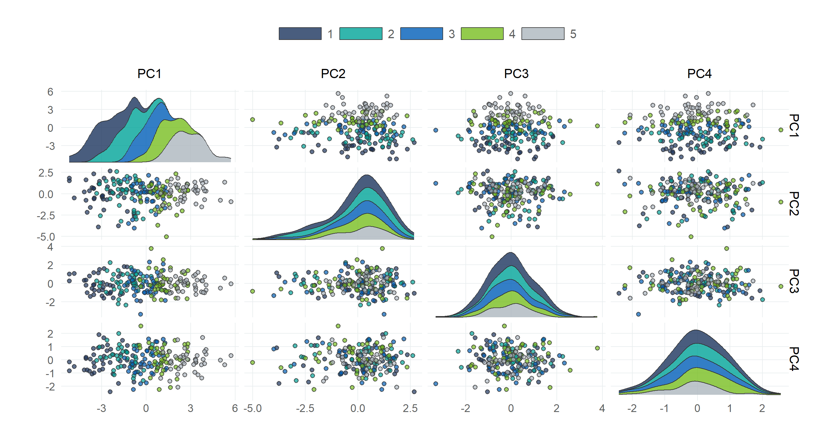
Figure 9.4: Plotting the distribution of the first two components on a two-dimensional plane
9.2 Clustering
Clustering is the process of grouping data into “clusters” based on the underlying patterns that explain the variance across all features in the data.
There are a wide variety of clustering algorithms that can be grouped into several different subtypes. Some of the most common approaches include partition clustering, density clustering2, and hierarchical clustering3, and model-based clustering) however, we will focus on the most common clustering algorithm, and a type of partition clustering- K-Means.
9.2.1 K-Means Clustering
K-means is a clustering algorithm that assigns each observation to \(k\) unique clusters (\(k\) clusters, defined by the user), based on which cluster centroid (the centre point) is nearest.
Specify number of clusters (centroids)
Those centroids are randomly placed in the data
Each observation assigned to its nearest centroid, measured using Euclidean distance4
Centre point (centroid) of each cluster is then calculated based on the observations in each cluster
The distance between observations in a cluster and their centroid (sum of squared Euclidean distances, or geometric mean) is measured
Centroids are iteratively shifted and clusters recalculated until the distance within clusters is minimised5
This interactive visualisation by Naftali Harris does a really good job of demonstrating how K-Means clustering works on a variety of different data structures.
The random process that initialises the k-means algorithm means that fitting k-means clustering to a dataset multiple times will lead to different outcomes, and it is therefore often a good idea to fit k-means algorithms multiple times and average over the results.
While k-means is a simple and relatively powerful algorithm, it is not without its drawbacks. K-means assumes that clusters are a certain shape (circular/elliptical), and where the internal structure of clusters is more complicated than that, k-means will not cope particularly well (and in this case density clustering algorithms will generally perform better).
# create cross-validation foldstrain_folds <-vfold_cv(train_df, v =5)# inspect the foldstrain_folds
# A tibble: 30 × 7
   num_clusters .metric          .estimator        mean     n     std_err .config
          <int> <chr>            <chr>            <dbl> <int>       <dbl> <chr>
 1           10 sse_ratio        standard        0.0837     5     0.00119 Preprocessor1_Model10
 2            9 sse_ratio        standard        0.0916     5     0.00162 Preprocessor1_Model09
 3            8 sse_ratio        standard        0.101      5     0.00213 Preprocessor1_Model08
 4            7 sse_ratio        standard        0.114      5     0.00228 Preprocessor1_Model07
 5            6 sse_ratio        standard        0.128      5     0.00271 Preprocessor1_Model06
 6            5 sse_ratio        standard        0.148      5     0.00257 Preprocessor1_Model05
 7            4 sse_ratio        standard        0.192      5     0.00228 Preprocessor1_Model04
 8            3 sse_ratio        standard        0.267      5     0.00277 Preprocessor1_Model03
 9            2 sse_ratio        standard        0.438      5     0.00221 Preprocessor1_Model02
10            1 sse_ratio        standard        1          5     0       Preprocessor1_Model01
11           10 sse_within_total standard    78742.         5  1093.      Preprocessor1_Model10
12            9 sse_within_total standard    86210.         5  1113.      Preprocessor1_Model09
13            8 sse_within_total standard    95103.         5  1024.      Preprocessor1_Model08
14            7 sse_within_total standard   106773.         5  1028.      Preprocessor1_Model07
15            6 sse_within_total standard   120080.         5  1196.      Preprocessor1_Model06
16            5 sse_within_total standard   138864.         5  1505.      Preprocessor1_Model05
17            4 sse_within_total standard   181114.         5  4108.      Preprocessor1_Model04
18            3 sse_within_total standard   251509.         5  7870.      Preprocessor1_Model03
19            2 sse_within_total standard   413156.         5  9647.      Preprocessor1_Model02
20            2 sse_total        standard   942242.         5 20916.      Preprocessor1_Model02
21            7 sse_total        standard   942242.         5 20916.      Preprocessor1_Model07
22            8 sse_total        standard   942242.         5 20916.      Preprocessor1_Model08
23            4 sse_total        standard   942242.         5 20916.      Preprocessor1_Model04
24            6 sse_total        standard   942242.         5 20916.      Preprocessor1_Model06
25            1 sse_total        standard   942242.         5 20916.      Preprocessor1_Model01
26            1 sse_within_total standard   942242.         5 20916.      Preprocessor1_Model01
27            5 sse_total        standard   942242.         5 20916.      Preprocessor1_Model05
28            9 sse_total        standard   942242.         5 20916.      Preprocessor1_Model09
29           10 sse_total        standard   942242.         5 20916.      Preprocessor1_Model10
30            3 sse_total        standard   942242.         5 20916.      Preprocessor1_Model03
Due to the way k-means clustering works, adding clusters will generally improve the performance of the model, so it is no surprise to see that the model performance, according to all three metrics, is more or less ordered by the number of clusters. This doesn’t mean you should just be looking to add as many clusters as possible though. If \(k\) clusters = \(n\) observations then the distance will be zero.
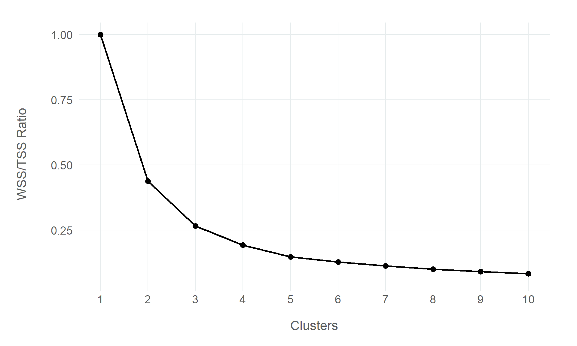
So choosing the number of clusters is a non-trivial decision, and this is where data science becomes a little more art than science. One of the common approaches to choosing the number of clusters is the “Elbow” method (sometimes referred to as a Scree Plot), which plots the WSS/TSS ratio produced by the model when it has a certain amount of clusters.
cluster_metrics |>filter(.metric =="sse_ratio") |>ggplot(aes(x = num_clusters, y = mean)) +geom_point(size =3) +geom_line(linewidth =1) +labs(x ="Clusters", y ="WSS/TSS Ratio") +scale_x_continuous(breaks =1:10)
Figure 9.5: Validation results from the principal components analysis
It is called the Elbow method because the goal is to identify the “elbow” in the line, where the marginal gains that each additional cluster is not great enough to justify its inclusion in the model.
In the above plot, the biggest drop is from one cluster to two, which is typical, but from two clusters, to three, and possibly even four, there is a greater drop in the WSS/TSS ratio than in the additional clusters after that point.
James, Gareth, Daniela Witten, Trevor Hastie, Robert Tibshirani, and Jonathan Taylor. 2023. An Introduction to Statistical Learning. Springer. https://www.statlearning.com/.
Multicollinearity occurs when explanatory/predictor variables in your model are correlated with each other (Çetinkaya-Rundel and Hardin 2021). It can reduce the accuracy of your model and bias the estimates.↩︎
Density clustering treats clustering as a problem of high- and low-density in the feature space. Density-Based Spatial Clustering of Applications with Noise (DBSCAN) builds clusters from areas of high density in the feature space, and finds the cut-off point based on the areas of low density.↩︎
Hierarchical clustering is an approach to clustering that assumes the latent structure that defines the data is hierarchical in nature. It clusters data by nesting clusters and merging or splitting them iteratively. The most common hierarchical algorithm is Agglomerative Clustering, which takes a bottom-up approach, with each observation being a distinct cluster, and merges clusters iteratively.↩︎
The Euclidean distance between two points is the length of a straight line between them, and it can be calculated using the Cartesian coordinates of the points.↩︎
There are variations on this iterative process (which is called the Lloyd method), such as the MacQueen method and Hartigan-Wong.↩︎
Source Code
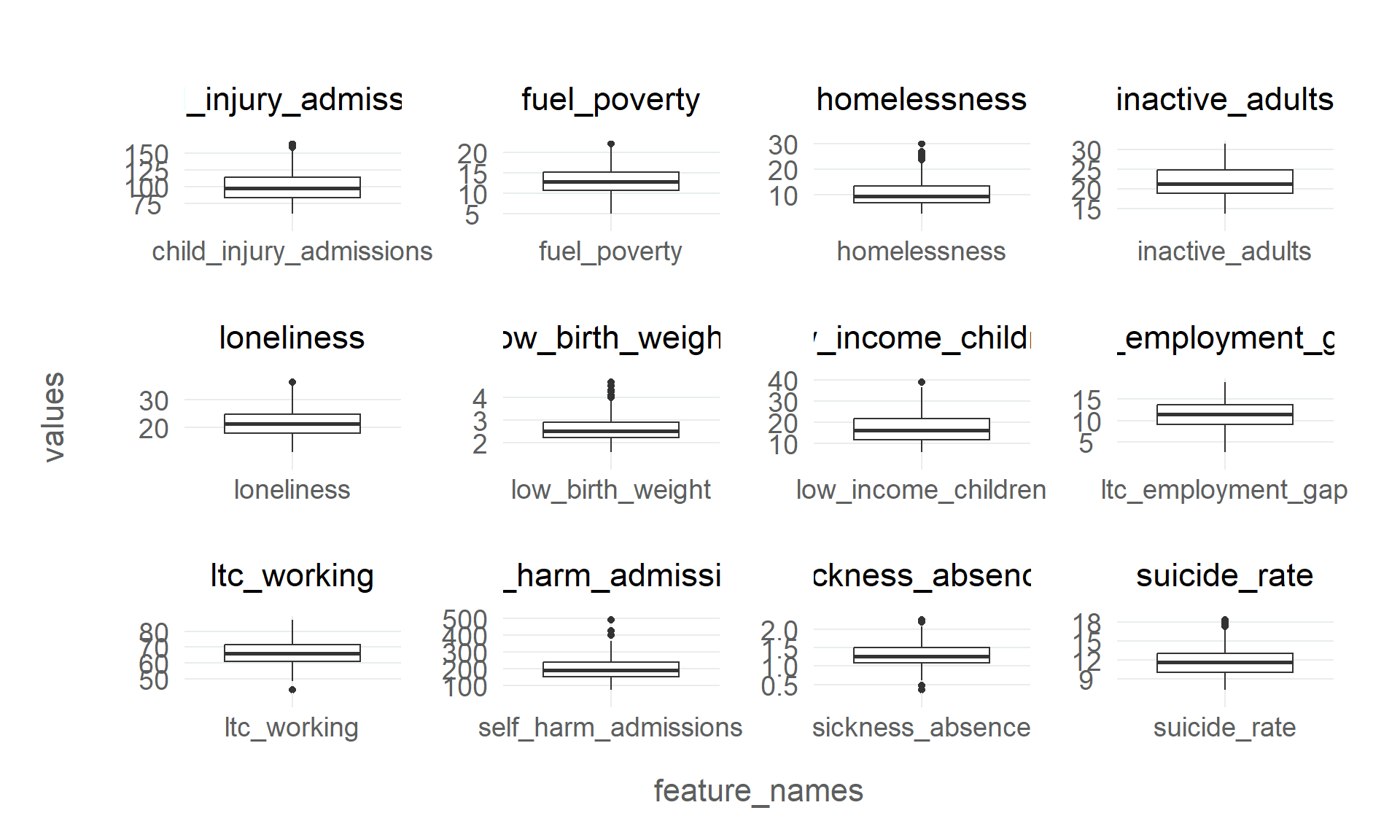
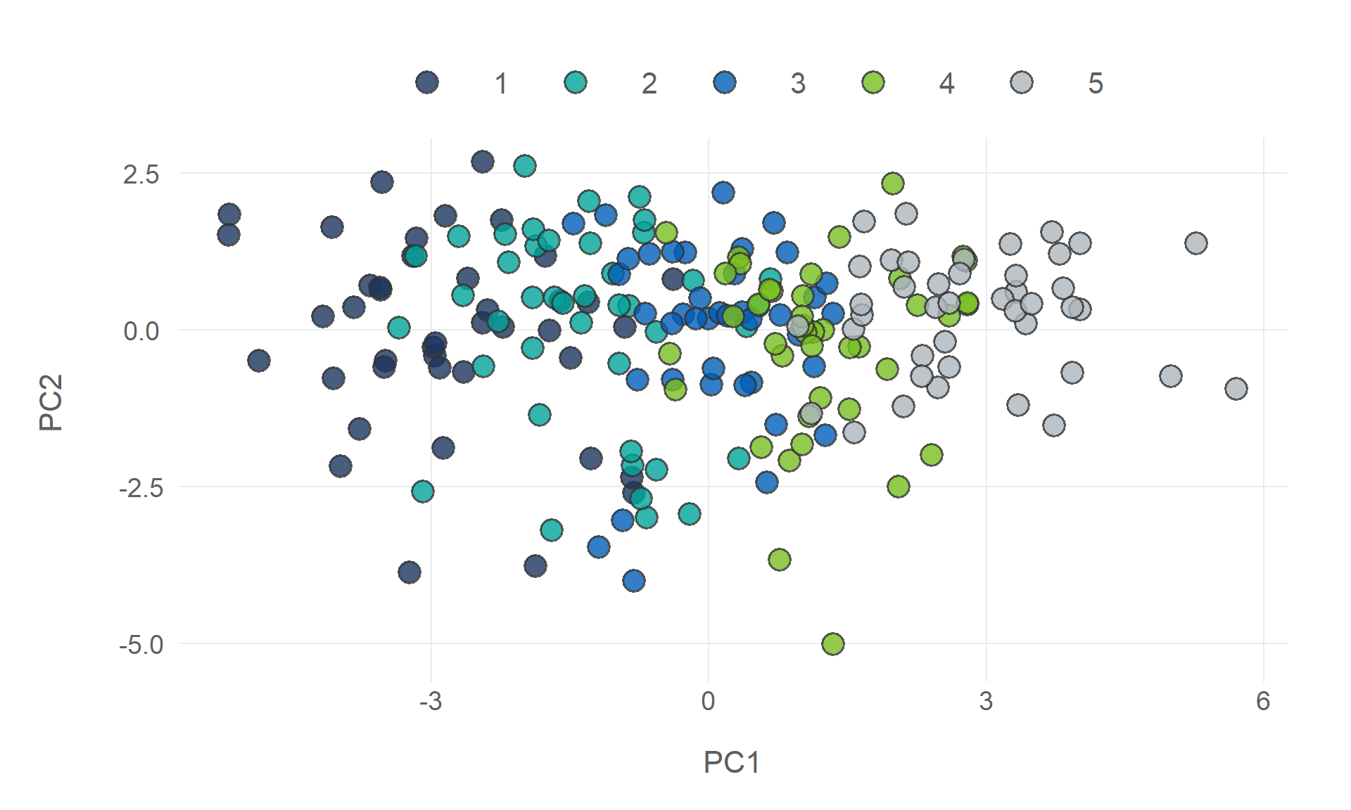
# Unsupervised Learning {#sec-unsupervised-learning}{{< include _links.qmd >}}```{r}#| label: setup#| cache: false#| output: false#| code-fold: true#| code-summary: 'Setup Code (Click to Expand)'# packages needed to run the code in this section# install.packages(c("tidyverse", "tidymodels", "tidyclust, "remotes"))# remotes::install_github("NHS-South-Central-and-West/scwplot")# import packagessuppressPackageStartupMessages({library(tidymodels)library(tidyclust)library(dplyr)library(ggplot2)})# import datapublic_health <- readr::read_csv(here::here("data", "public_health.csv")) |>mutate(imd_quartile =case_match( imd_decile,c(1, 2) ~1,c(3, 4) ~2,c(5, 6) ~3,c(7, 8) ~4,c(9, 10) ~5 ) )# set plot themetheme_set(scwplot::theme_scw(base_size =14))# set random seedset.seed(123)```Unsupervised learning is a domain of machine learning that handles input data that is unlabelled. While supervised learning takes a label, like a binary variable that represents whether someone has a certain disease or not (classification), or a continuous variable of the days someone has spent in hospital (regression), unsupervised learning is not trying to predict a particular outcome. Instead, the goal of unsupervised learning is to learn/model the underlying structure of the data, and using that process to explain that data.This creates some inherent complexity to the process of unsupervised learning that isn't a consideration when doing supervised learning. Most of all, it is difficult to know what features should go in the model and how to validate the model after you have built it. Unsupervised learning tends to get boiled down to clustering when it is introduced as a domain of machine learning. While this is definitely the most popular way this domain is used, there's a lot more to it than that.In this chapter, we will build a clustering model, while discussing some other areas of unsupervised learning that might be of some interest.The two big areas of unsupervised learning are dimensionality reduction and clustering.## Dimensionality ReductionOne of the most common goals of unsupervised learning is trying to reduce complicated datasets with many dimensions (columns/features/variables) down to a smaller, more easily understood dataset. There are lots of use cases for this sort of process. One particularly common use case is visualising a complex dataset with many dimensions using just two dimensions.It can also be a really useful step in the data preprocessing of building either a supervised or unsupervised machine learning model. When there are multiple related features in your model, multicollinearity^[Multicollinearity occurs when explanatory/predictor variables in your model are correlated with each other [@cetinkaya2021]. It can reduce the accuracy of your model and bias the estimates.] can weaken the predictive performance of your model, or limit its capacity to identify a meaningful latent structure in the data. Dimensionality reduction attempts to squash these related features down to just one feature (dimension) and give a representation of those features that captures their contribution to the variance in the data. ### Principal Component AnalysisThe most popular (and still very useful) approach to dimensionality reduction is a method called Principal Component Analysis (PCA). PCA reduces data to fewer dimensions by taking the centre point of the space the data exists in (often referred to as a hyperplane or a feature subspace), and finds the axes in that space that captures the data (or the variance in the data) in simpler terms (fewer dimensions). This involves taking the I find a simple way of thinking about this process is that it is about taking a "large set of correlated variables" and summarising them "with a smaller number of representative variables that collectively explain most of the variability in the original set" [@james2023]. When PCA reduces a dataset to fewer dimensions, the first principal components should capture most of the variance in the data.There are lots of other methods for doing dimensionality reduction (some examples include Linear Discriminant Analysis, UMAP, t-SNE), we will stick with PCA in this guide, to show you what this process is doing, and how it can be useful in a variety of data science contexts.Although unsupervised methods do not have labels that they will try to predict, validating an unsupervised model still requires data, and using the same variables that the model has been trained on is a problematic way of evaluating performance, because a model that has been trained on the underlying structure of a set of variables should probably do quite a good job when given those same variables!Therefore, in this instance, we will use the IMD Deciles as our validation data. The public health data we are using has a number of variables that should contribute to deprivation (or that are negatively impacted by deprivation), so we should expect a good model to fit well to IMD deciles.```{r}#| label: split-datatrain_test_split <-initial_split(public_health, strata ="imd_quartile", prop = .7)# extract training and test setstrain_df <-training(train_test_split)test_df <-testing(train_test_split)``````{r}#| label: fig-corr-plot#| column: screen-inset#| fig-width: 20#| fig-height: 10#| fig-cap: |#| Correlation matrix for all numerical variables in the Public Health datasettrain_df |>select(-starts_with("area"), -starts_with("imd")) |> janitor::clean_names(case ="title", abbreviations =c("LTC")) |>cor() |> ggcorrplot::ggcorrplot(type ="lower", lab =TRUE, lab_col ="#333333",ggtheme = scwplot::theme_scw(base_size =10)) + scwplot::scale_fill_diverging(palette ="blue_green")``````{r}#| label: boxplotsdf_numeric_long <- train_df |>select(-starts_with("area"), -imd_score, -imd_decile) |>pivot_longer(!imd_quartile, names_to ="feature_names", values_to ="values") df_numeric_long |>ggplot(mapping =aes(x = feature_names, y = values)) +geom_boxplot() +facet_wrap(~ feature_names, ncol =4, scales ="free")```There's a reasonable amount of variance with several variables.```{r}#| label: pca-recipepca_recipe <-recipe(imd_quartile ~ ., data = train_df) |>step_rm(all_nominal(), "imd_score", "imd_decile") |>step_zv(all_numeric_predictors()) |> bestNormalize::step_orderNorm(all_numeric_predictors()) |>step_normalize(all_numeric_predictors())```We can borrow a method taken from the [Tidy Modelling with R][Feature Extraction] book, for plotting PCA results and validating model performance. ```{r}#| label: validation-plot-functionplot_validation_results <-function(recipe, data = train_df) { recipe |># estimate additional stepsprep() |># process databake(new_data = data) |># scatterplot matrixggplot(aes(x = .panel_x, y = .panel_y,colour =as.factor(imd_quartile),fill =as.factor(imd_quartile))) +geom_point(shape =21, size =2, stroke =1,alpha = .7, colour ="#333333",show.legend =FALSE) + ggforce::geom_autodensity(alpha = .8, colour ="#333333") + ggforce::facet_matrix(vars(-imd_quartile), layer.diag =2) + scwplot::scale_colour_qualitative(palette ="scw") + scwplot::scale_fill_qualitative(palette ="scw")}``````{r}#| label: fig-pca-validation#| column: screen-inset#| fig-width: 15#| fig-height: 8#| fig-cap: |#| Validation results from the principal components analysispca_recipe |>step_pca(all_numeric_predictors(), num_comp =4) |>plot_validation_results()``````{r}#| label: fig-pca-loadings#| column: screen-inset#| fig-width: 15#| fig-height: 8#| fig-cap: |#| Plotting the features that are most predictive of each PCA componentpca_recipe |>step_pca(all_numeric_predictors(), num_comp =4) |>prep() |>tidy(5) |>filter(component %in%paste0("PC", 1:4)) |>mutate(component = forcats::fct_inorder(component),terms = snakecase::to_title_case(terms, abbreviations ="LTC"),direction =case_when( value >0~"Positive", value <0~"Negative" ),abs_value =abs(value) ) |>slice_max(abs_value, n =10, by = component) |>arrange(component, abs_value) |>mutate(order =row_number()) |>ggplot(aes(x =reorder(terms, order), y = value, fill = direction)) +geom_col(colour ="#333333", show.legend =FALSE) +geom_hline(yintercept =0, linewidth =1, colour ="#333333") +coord_flip() +facet_wrap(vars(component), scales ="free_y") +labs(x =NULL, y ="Value of Contribution") +scale_y_continuous(breaks =seq(-.5, .75, .25)) + scwplot::scale_fill_qualitative(palette ="scw") +theme(axis.text.y =element_text(hjust =1),axis.title.x =element_text(hjust = .4) )``````{r}#| label: fig-pca-distributions#| fig-cap: |#| Plotting the distribution of the first two components on a #| two-dimensional planepca_recipe |>step_pca(all_numeric_predictors(), num_comp =4) |>prep() |>juice() |>ggplot(aes(PC1, PC2, fill =as.factor(imd_quartile))) +geom_point(shape =21, size =5, stroke =1,alpha = .8, colour ="#333333") + scwplot::scale_fill_qualitative(palette ="scw")```## ClusteringClustering is the process of grouping data into "clusters" based on the underlying patterns that explain the variance across all features in the data.There are a wide variety of clustering algorithms that can be grouped into several different subtypes. Some of the most common approaches include partition clustering, density clustering^[Density clustering treats clustering as a problem of high- and low-density in the feature space. Density-Based Spatial Clustering of Applications with Noise (DBSCAN) builds clusters from areas of high density in the feature space, and finds the cut-off point based on the areas of low density.], and hierarchical clustering^[Hierarchical clustering is an approach to clustering that assumes the latent structure that defines the data is hierarchical in nature. It clusters data by nesting clusters and merging or splitting them iteratively. The most common hierarchical algorithm is Agglomerative Clustering, which takes a bottom-up approach, with each observation being a distinct cluster, and merges clusters iteratively.], and model-based clustering) however, we will focus on the most common clustering algorithm, and a type of partition clustering- K-Means.### K-Means ClusteringK-means is a clustering algorithm that assigns each observation to $k$ unique clusters ($k$ clusters, defined by the user), based on which cluster centroid (the centre point) is nearest.- Specify number of clusters (centroids)- Those centroids are randomly placed in the data- Each observation assigned to its nearest centroid, measured using Euclidean distance^[The Euclidean distance between two points is the length of a straight line between them, and it can be calculated using the Cartesian coordinates of the points.]- Centre point (centroid) of each cluster is then calculated based on the observations in each cluster- The distance between observations in a cluster and their centroid (sum of squared Euclidean distances, or geometric mean) is measured- Centroids are iteratively shifted and clusters recalculated until the distance within clusters is minimised^[There are variations on this iterative process (which is called the Lloyd method), such as the MacQueen method and Hartigan-Wong.]This [interactive visualisation](https://www.naftaliharris.com/blog/visualizing-k-means-clustering/) by Naftali Harris does a really good job of demonstrating how K-Means clustering works on a variety of different data structures.The random process that initialises the k-means algorithm means that fitting k-means clustering to a dataset multiple times will lead to different outcomes, and it is therefore often a good idea to fit k-means algorithms multiple times and average over the results.While k-means is a simple and relatively powerful algorithm, it is not without its drawbacks. K-means assumes that clusters are a certain shape (circular/elliptical), and where the internal structure of clusters is more complicated than that, k-means will not cope particularly well (and in this case density clustering algorithms will generally perform better).```{r}#| label: cv-folds# create cross-validation foldstrain_folds <-vfold_cv(train_df, v =5)# inspect the foldstrain_folds``````{r}#| label: set-kmeans-gridkmeans_spec <-k_means(num_clusters =tune()) |>set_engine(engine ="stats", nstart =1000)cluster_recipe <-recipe(~ ., data = train_df) |>step_rm(all_nominal(), starts_with("imd"))cluster_wflow <-workflow(cluster_recipe, kmeans_spec)cluster_grid <-grid_regular(num_clusters(), levels =10)```We will tune the model and measure the model performance using three different metrics:- `sse_within_total` - Total Within-Clusters Sum of Squared Errors (WSS)- `sse_total` - Total Sum of Squared Errors (TSS)- `sse_ratio` - Ratio of WSS to TSS```{r}#| label: tune-kmeansres <-tune_cluster( cluster_wflow,resamples = train_folds,grid = cluster_grid,control =control_grid(save_pred =TRUE, extract = identity),metrics =cluster_metric_set(sse_within_total, sse_total, sse_ratio))cluster_metrics <- res |>collect_metrics() cluster_metrics |>arrange(mean, std_err) |>print(n =30)```Due to the way k-means clustering works, adding clusters will generally improve the performance of the model, so it is no surprise to see that the model performance, according to all three metrics, is more or less ordered by the number of clusters. This doesn't mean you should just be looking to add as many clusters as possible though. If $k$ clusters = $n$ observations then the distance will be zero.So choosing the number of clusters is a non-trivial decision, and this is where data science becomes a little more art than science. One of the common approaches to choosing the number of clusters is the "Elbow" method (sometimes referred to as a Scree Plot), which plots the WSS/TSS ratio produced by the model when it has a certain amount of clusters.```{r}#| label: fig-elbow-plot#| fig-cap: |#| Validation results from the principal components analysiscluster_metrics |>filter(.metric =="sse_ratio") |>ggplot(aes(x = num_clusters, y = mean)) +geom_point(size =3) +geom_line(linewidth =1) +labs(x ="Clusters", y ="WSS/TSS Ratio") +scale_x_continuous(breaks =1:10)```It is called the Elbow method because the goal is to identify the "elbow" in the line, where the marginal gains that each additional cluster is not great enough to justify its inclusion in the model.In the above plot, the biggest drop is from one cluster to two, which is typical, but from two clusters, to three, and possibly even four, there is a greater drop in the WSS/TSS ratio than in the additional clusters after that point.```{r}#| label: fit-kmeanskmeans_spec <-k_means(num_clusters =4) |>set_engine(engine ="stats", nstart =1000)cluster_wflow <-workflow(cluster_recipe, kmeans_spec)kmeans_fit <- cluster_wflow |>fit(train_df)kmeans_fit |>extract_centroids()kmeans_fit |>summary()``````{r}#| label: silhouettekmeans_fit |>silhouette_avg(train_df, dist_fun = Rfast::Dist)```### Validation## Limitations/Issues with Unsupervised Learning## Next Steps## Resources- [Tidy Modeling With R: Dimensionality Reduction]- [Introduction to Statistical Learning: Unsupervised Learning Code]- [Hands on Machine Learning With R: Dimensional Reduction]- [Hands on Machine Learning With R: Clustering][Tidy Modeling With R: Dimensionality Reduction]: https://www.tmwr.org/dimensionality[Feature Extraction]: https://www.tmwr.org/dimensionality#feature-extraction-techniques[Introduction to Statistical Learning: Unsupervised Learning Code]: https://hastie.su.domains/ISLR2/Labs/Rmarkdown_Notebooks/Ch12-unsup-lab.html[{tidyclust}]: https://tidyclust.tidymodels.org/[{dbscan}]: https://github.com/mhahsler/dbscan[Hands on Machine Learning With R: Dimensional Reduction]: https://bradleyboehmke.github.io/HOML/pca.html[Hands on Machine Learning With R: Clustering]: https://bradleyboehmke.github.io/HOML/kmeans.html